Wearing Your Heart on Your Lapel
LONG BEFORE SOCIAL MEDIA became the norm for self-expression, the enduringly popular pinback button enabled Americans to showcase their feelings and beliefs. Pinned to everything from suit lapels to school backpacks, pinback buttons have promoted political statements and campaigns, expressed ideas and idioms, and served as icebreakers and conversation starters.
While the word “pinback” is quite obscure — referring to the “pin” on the “back” of a button that can be fastened to most any garment — the buttons themselves have become an ingrained part of everyday life.
Even George Washington’s devotees wore buttons with slogans sewn into their coats for his inauguration in 1789, but it would be another century until the popularity of pinback buttons surged. While many early buttons began to play a larger role in American politics, they also became popular in advertising, often serving as cereal box prizes to promote different products.
Much of our nation’s story could be told through these mass-produced objects — having covered every political campaign, the many wars of the 20th century, and the varied sentiments of Americans along the way. Even today, new buttons with new ideas adorn the backpacks of students across the country.
Coincidentally, postage stamps are similar in size to pinback buttons, and they also aspire to tell American stories, especially those we want to honor and remember. The opportunity to celebrate them for the Pinback Buttons stamps began to feel quite fortuitous.
The design challenge (and opportunity)
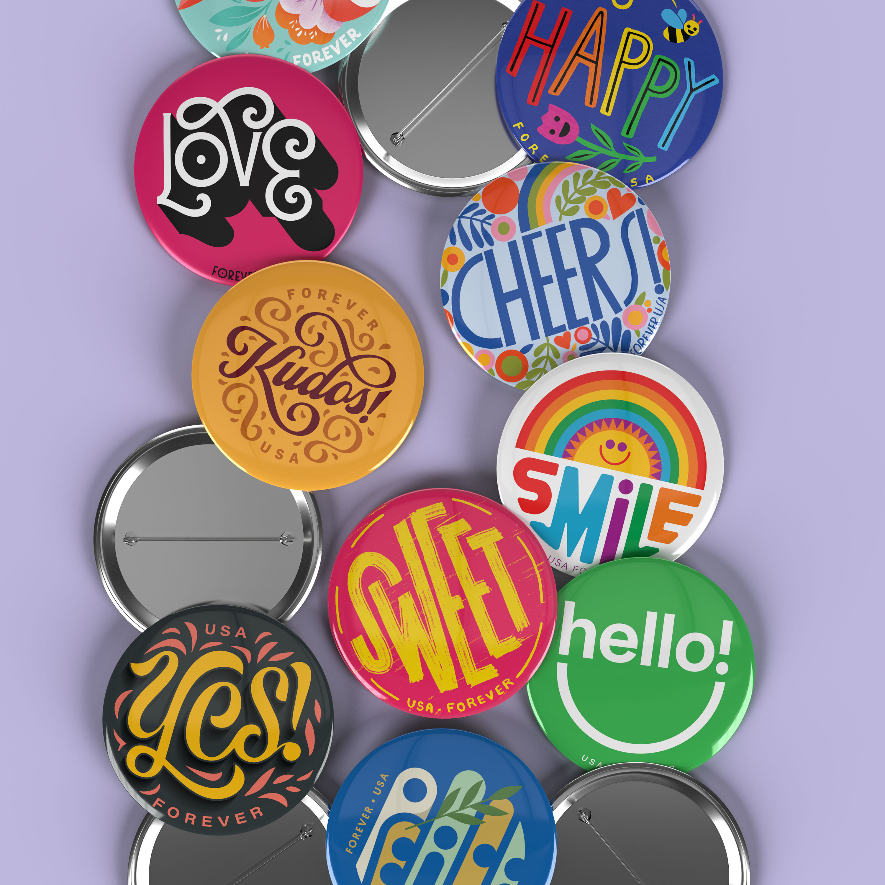
Because of their small dimensions, stamps can be challenging to design. But again, pinback buttons are relatively the same size as many stamps and, similarly, are designed for immediate visual impact. For Art Director Greg Breeding, the decision to make the stamps look like pinback buttons was almost obvious, but what would the buttons say?
Breeding wasn’t interested in recreating some of the buttons of the past, not least because many of them were political and designed for a particular moment in history. Instead, he began to imagine single words that might express affirmations, greetings, or sentiments. USPS wanted the button messages to be positive and upbeat.
After a lot of brainstorming, the research team came up with a long list of ideas, including some words from the sixties like “groovy,” “cool,” and “flower,” as well as more contemporary expressions like “lit,” “fire,” and “yaaas.” But the ones that resonated most felt more timeless and universal. Words like “love,” “cheers,” and “smile” began to set the tone for the personality of the stamps.
The idea of working with 10 [artists] at once felt a little overwhelming. But that turned out to be the best creative decision I made.
Breeding also began to imagine how each button might be designed to feel like part of a set while yet standing alone (as they most often do on envelopes). It occurred to him that a circular button format offered an organizing principle to visually hold the stamps together. "This set me free to explore how the typographic message of each stamp could be brought to life," he explains.
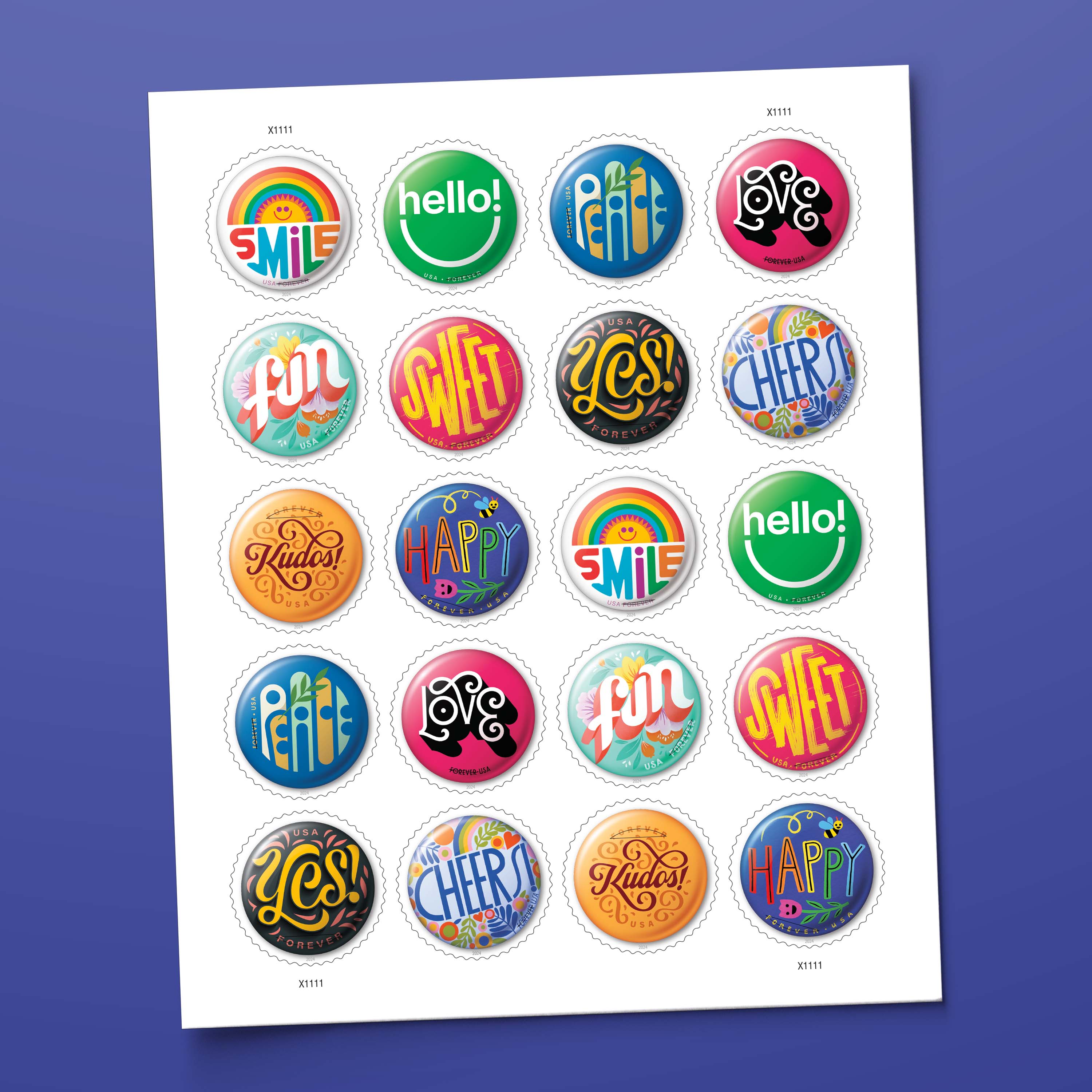
Ultimately, he decided to create 10 designs, each with a different expression. And he chose to commission a different artist for each word. "Although working with artists is the very best part of my role as an art director," Breeding says, "the idea of working with 10 at once felt a little overwhelming. But that turned out to be the best creative decision I made."
Some of the artists Breeding commissioned had never worked on a stamp before while a few of them were seasoned veterans. Some brought a painterly approach to the artwork while others made use of crisp, vector-based imagery. All of the artists brought an energy and passion for the project. "It made me feel like I was a part of something special," Breeding recalls.
He provided a coherent design brief and then stepped back to give each artist the freedom to explore fresh solutions. At no point in the process did they know what the others were doing, so it was Breeding's responsibility to provide direction while hoping for serendipity to bring the designs all together. "Sometimes I needed to encourage a color move to provide a spectrum for the pane of stamps," he says, "but without fail, each artist’s work exceeded my imagination for what each stamp could be."
Introducing the Pinback Buttons stamps
Once the project was completed and the artists had the opportunity to see what their colleagues had created, they provided their insights on the stamp design process. With excitement they shared their thoughts on how the circular format informed their process and how their assigned one-word expression impacted their approach.
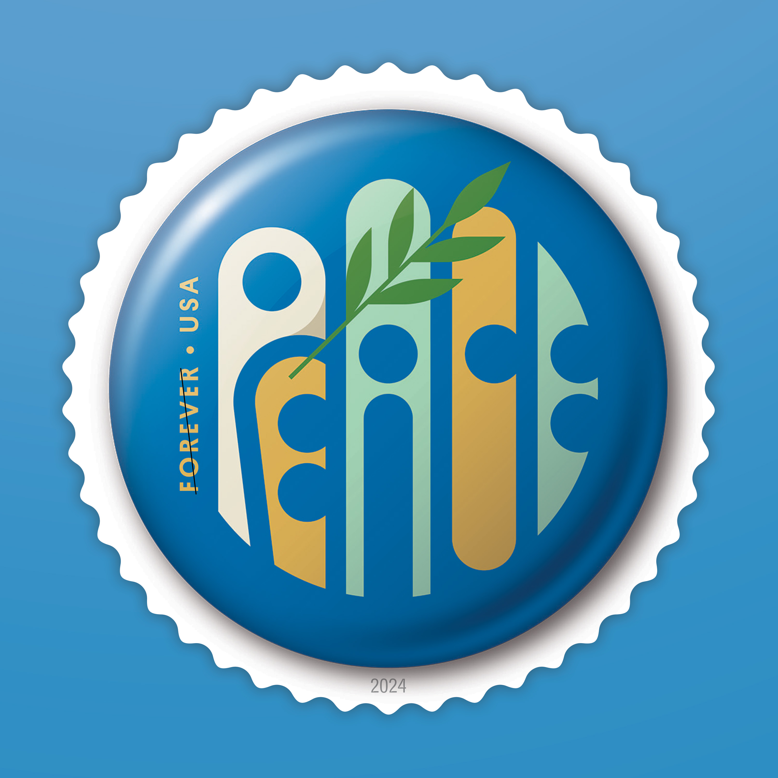
Jay Fletcher, peace stamp / @jpegfletcher
“I would say the final form — not just a postage stamp, but a round one at that — almost entirely informed the process and final design, all the way down to the circular negative space I incorporated in the letterforms. I like being put within some sort of box at the start of a project. I need to have specific constraints in order for the creative part of my brain to fully turn on, and the brief for the pinback button stamps was the perfect springboard.”
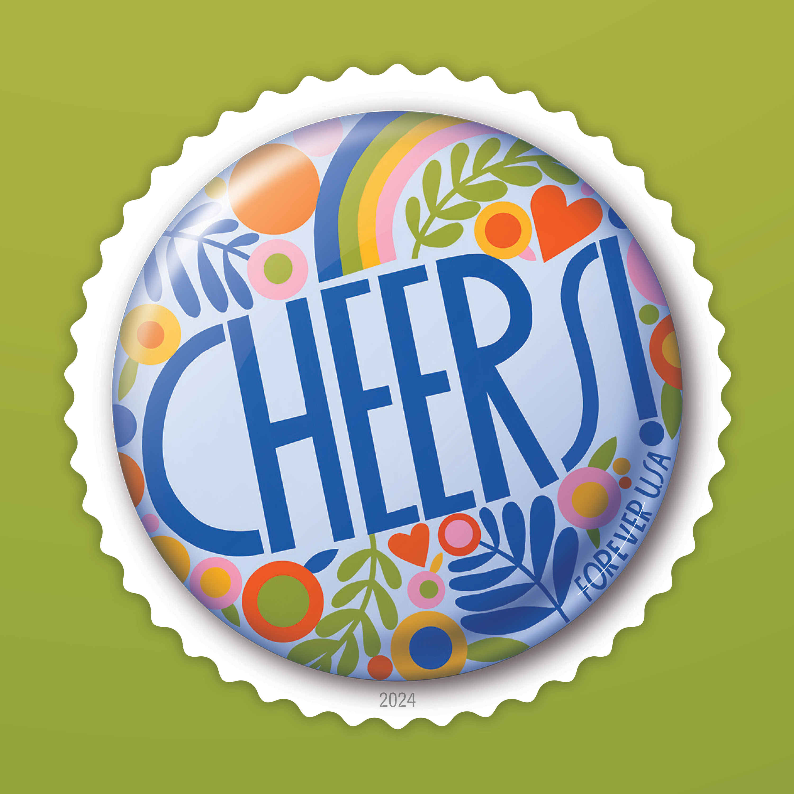
Lisa Congdon, cheers! stamp / @lisacongdon
“Designing things in a round shape is definitely not something most designers and illustrators are used to! I always enjoy a challenge and working outside my comfort zone, and this project was a great example of that. I create most of my work with the intention to share a sense of joy or hopefulness, and I hope that seeing this round stamp makes people smile!”
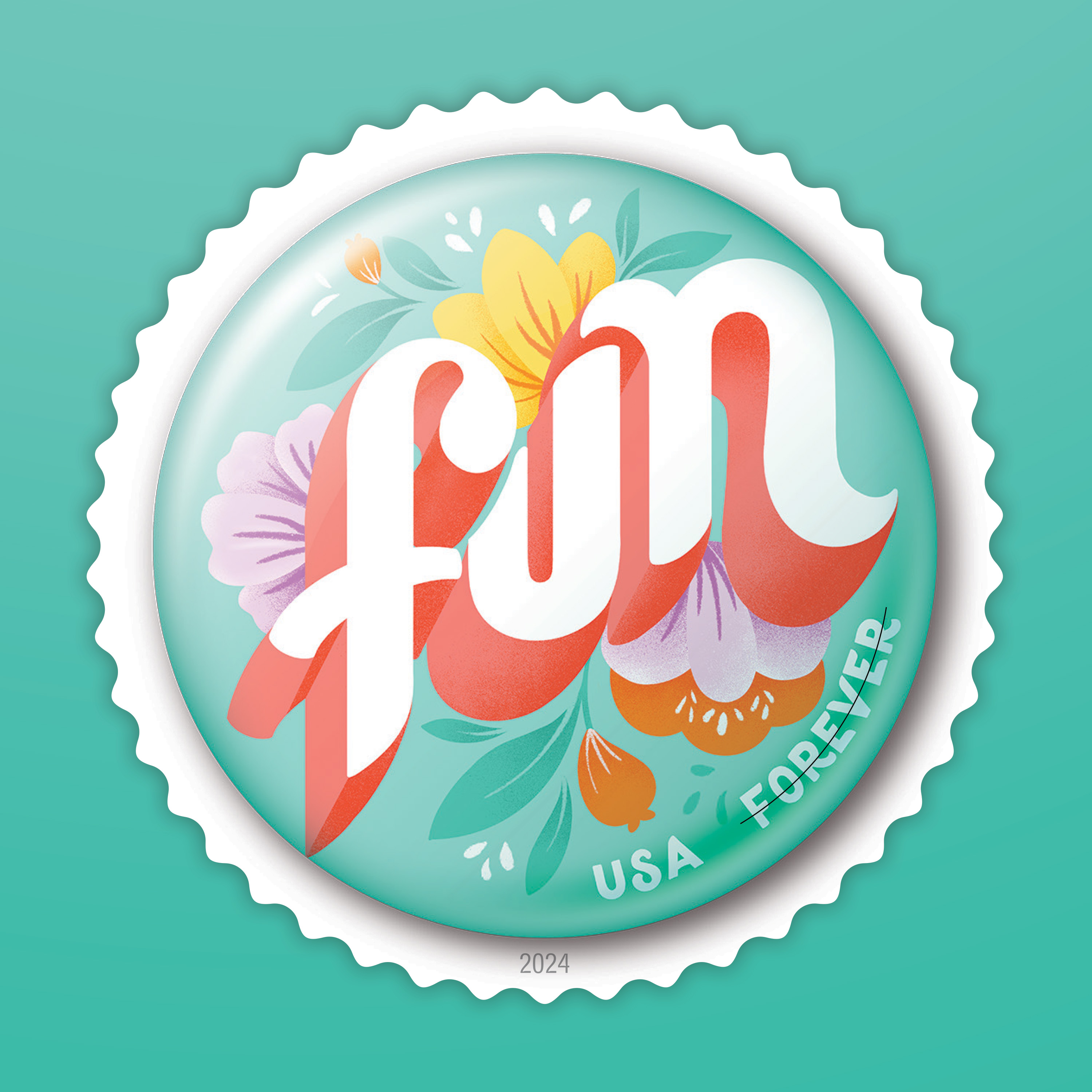
Gia Graham, fun stamp / @iamgiagraham
“Lettering the word on an angle helped me maximize the available space, and I was able to use the flowers and foliage to complete the circular composition. Since the final product will be so small, I kept the lettering bold and tiny details to a minimum.”
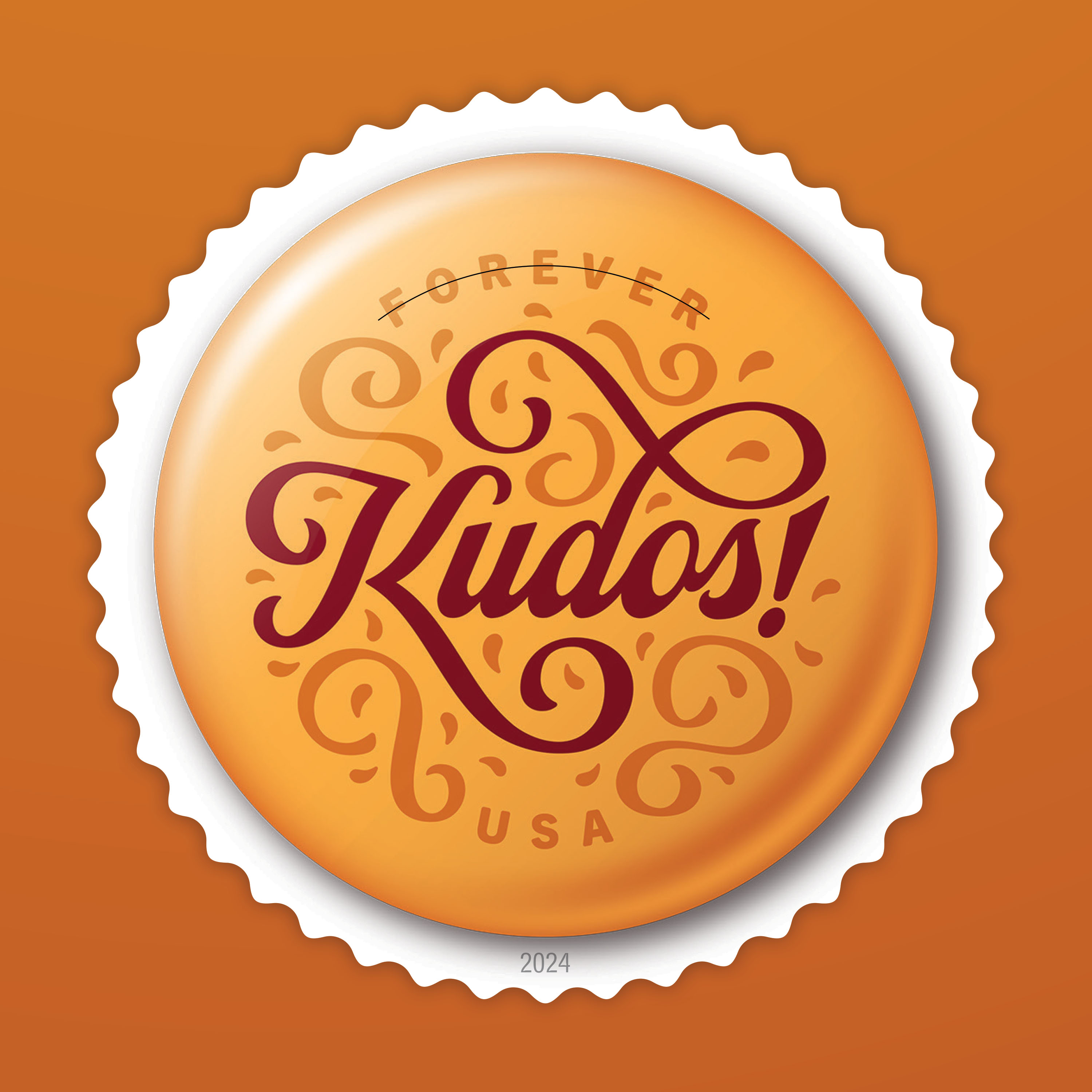
DKNG Studios, kudos! stamp / @dkngstudios
“The word ‘kudos’ goes beyond a simple ‘congrats,’ and even the definition of the word mentions ‘achievement’ and ‘prestige,’ so we wanted to give the stamp a bit of elegance and importance by setting it in script lettering and a sophisticated color palette. Everyone loves to receive a congratulatory letter in the mail, so we hope that those who do receive an envelope stamped with ‘kudos!’” — Nathan Goldman
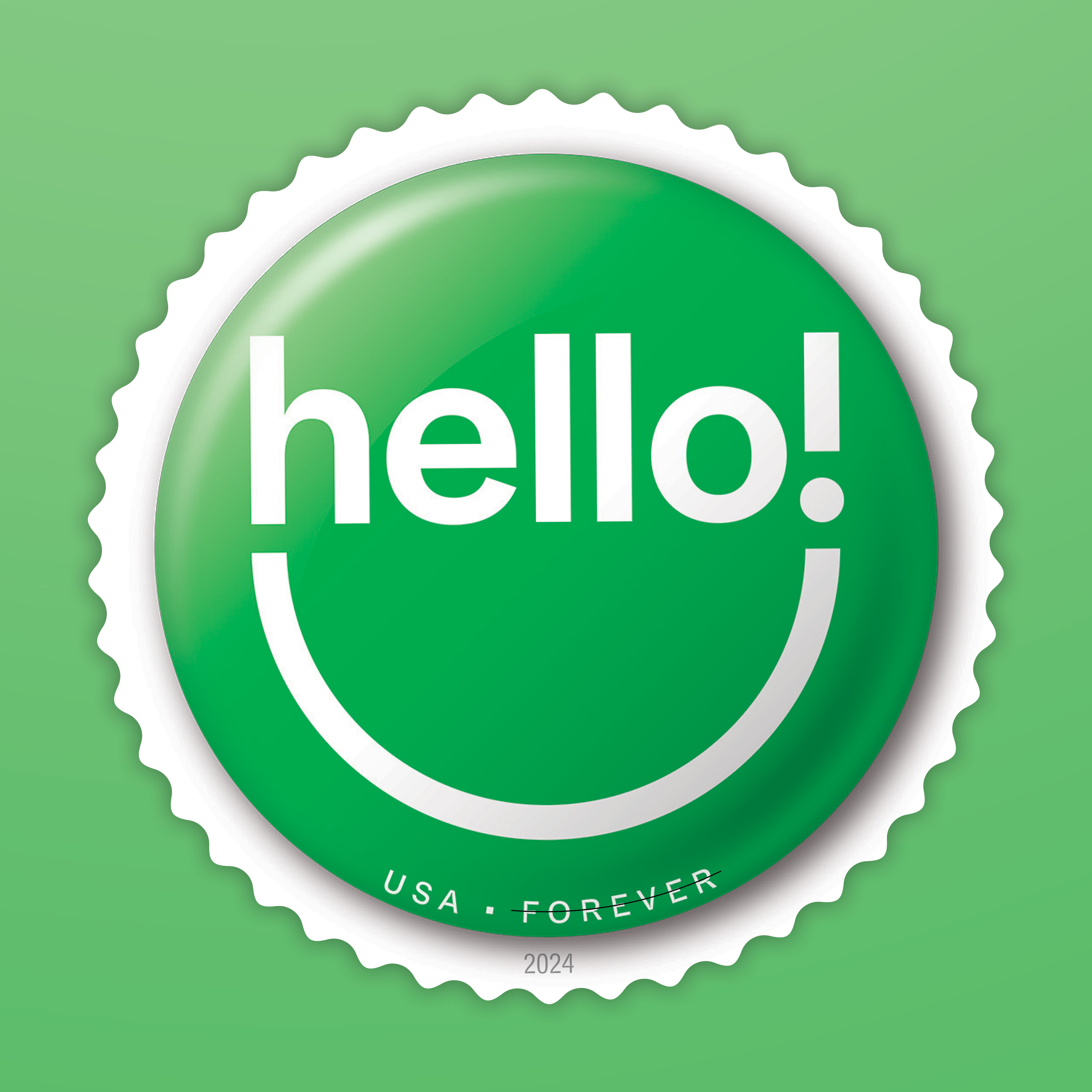
Tré Seals, hello! stamp / Vocal Type @vocaltype.co
“When I designed this stamp, I focused on the idea that a simple ‘hello!’ can put a smile on anyone's face. While the design conveys this idea, the color palette was actually the most difficult part. Looking at color psychology, I couldn't use yellow, because it makes babies cry, nor could I use pink because it connects more to ‘love’ than ‘hello.’ However, green has this association with optimism that really tied the whole design together.”
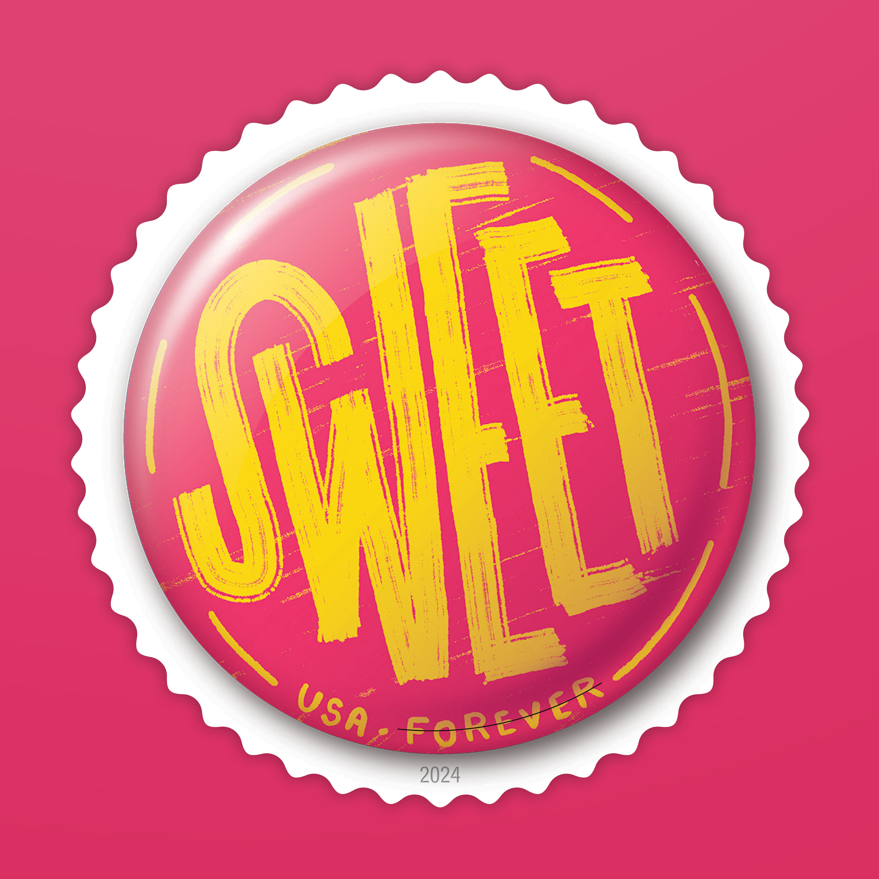
Jeff Rogers, sweet stamp / @frogers
“I think the main thing was just to try and kill the urge to do anything too overly detailed. Since it was one word, I felt like bold and simple was better. I did show some pretty detailed sketches, though, just to see how it could work but ultimately simple and bold won. I just hope when people see the SWEET stamp, they don't hold back the urge to say ‘SWEET’ out loud.”
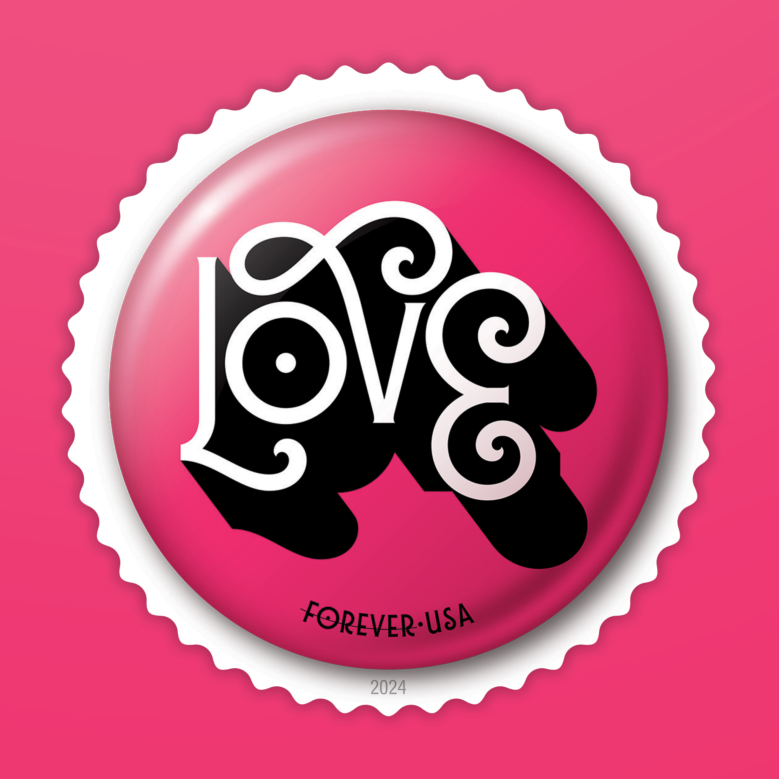
Juan Carlos Pagan, love stamp / @juancarlospagan
“I was lucky enough to get the word ‘love.’ I could not be happier about that. The type itself almost feels like love. The letters are spilling over each other, almost hugging. I added the shadow to the word in order to give it a bit of depth because love is not some shallow concept. It has depth. It lives deep down inside all of us.”
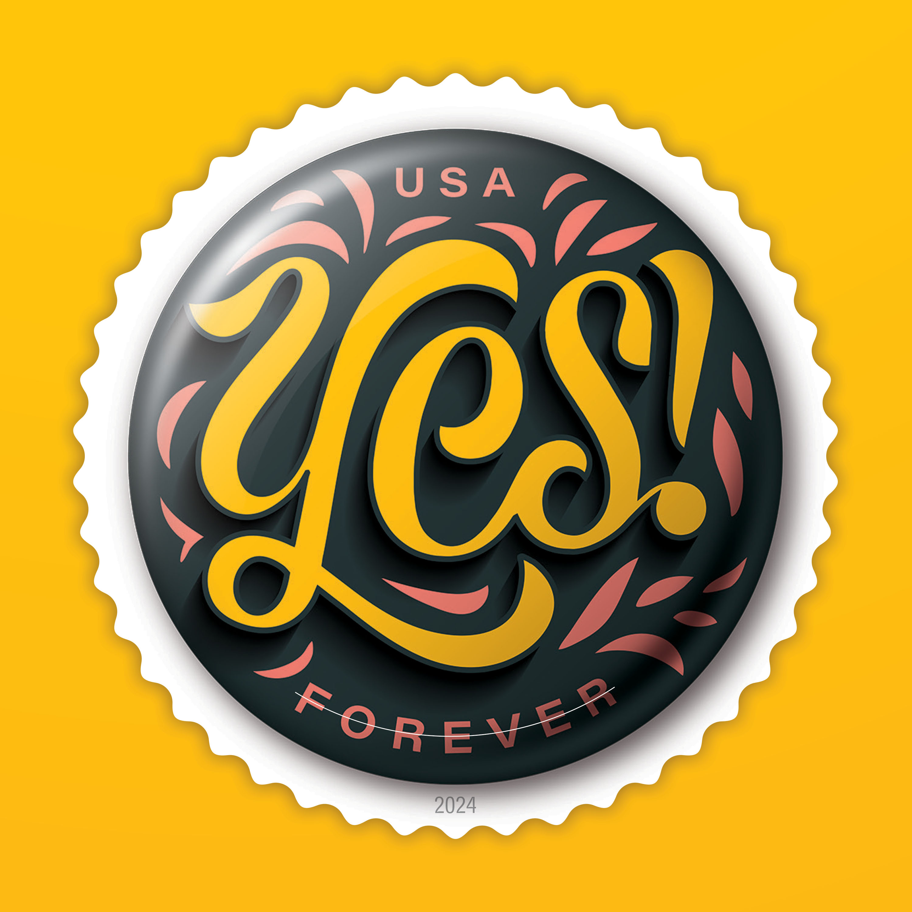
Ryan Feerer, yes! stamp / @ryanfeerer
“[With] the happy colors, unique round shape, and affirmative message of one of the most positive words in the dictionary, ‘yes!’ aims to create a small moment of delight. Hopefully, the stamp brightens the recipient's day, because we could all use a little extra happiness, even in a small way.”
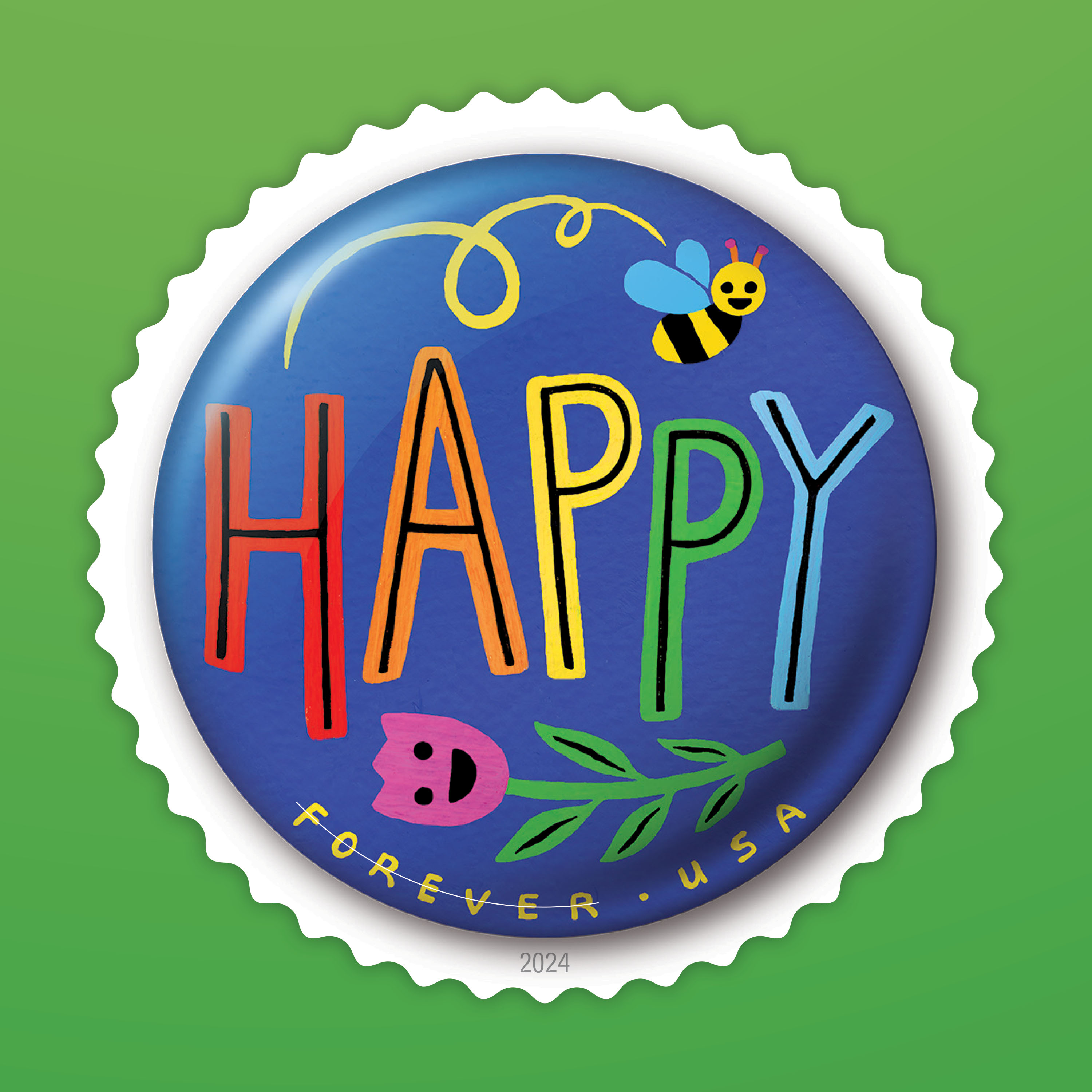
Gina Triplett, happy stamp / @ginatriplett
“When I was in high school, we’d wear groups of pinback buttons on our jackets. The choices you made in them individually and as a curated group were such a big piece of stating your identity to the pre-internet world. In this project, it was fun to think about how my button would be its own singular statement while also being a part of the collective group voice.”
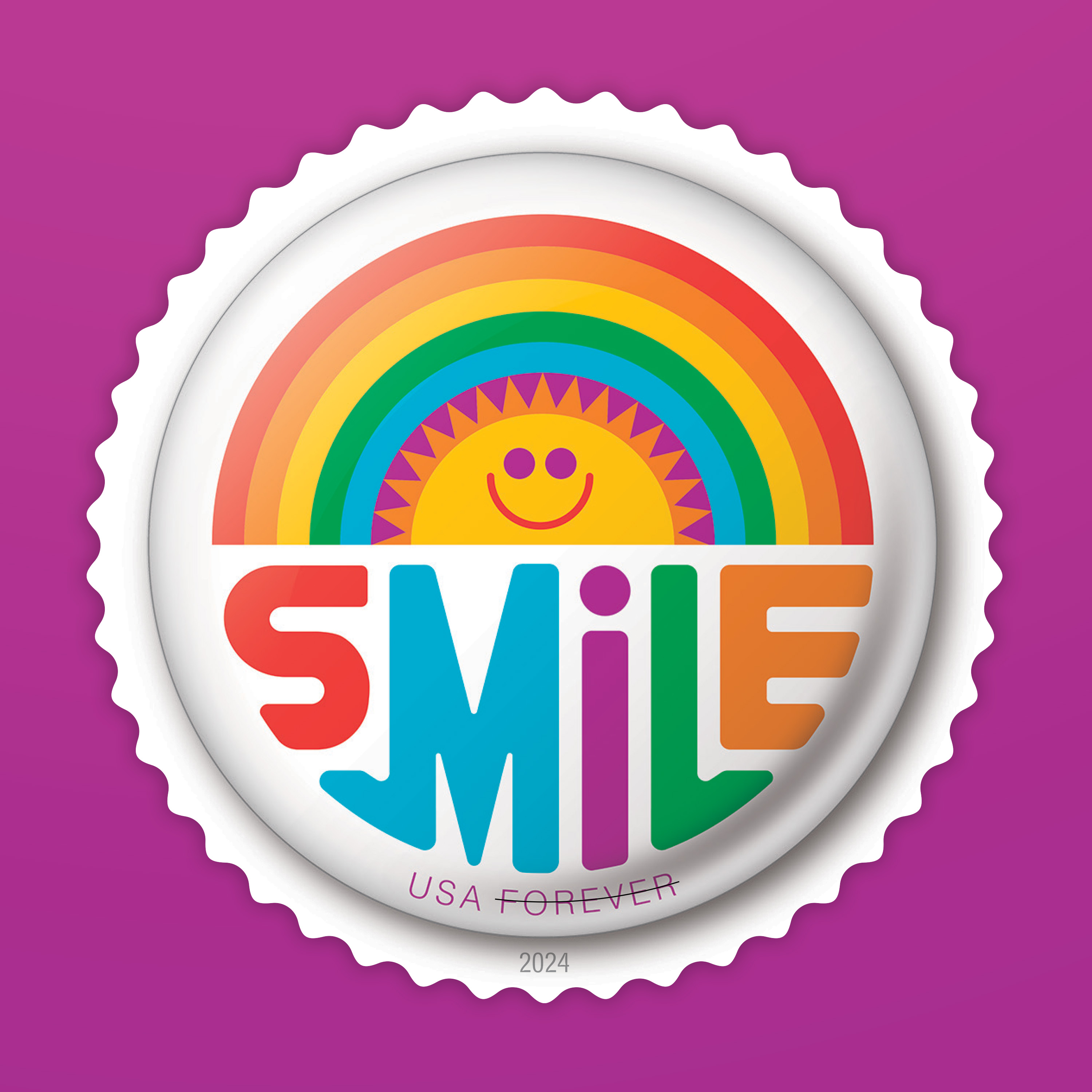
Don Clark, smile stamp / Invisible Creature @icreature
“SMILE. I loved having that word as my muse. I’ve always said that I hope our work elicits a smile from people, and I think our stamp design embodies that sentiment perfectly. I think the circular size dictated a lot with regards to how I wanted the stamp to look. I knew that I wanted to really utilize the circle shape with the design. The sun-and-rainbow idea really was born out of that.”
Presenting the best of America
As with many pinback buttons, postage stamps strive to present the best of America, and those stories are most often born out of historical events or extraordinary persons. But sometimes, the eclectic ephemera of our culture provide a different kind of springboard for fresh ideas that are surprising and engaging.
Breeding's hope is that the Pinback Buttons stamps evoke, for older generations, a time when their button choices reflected who they were. Similarly, he hopes that these stamps encourage younger generations to stand up for what they believe. Above all, Breeding reflects, “I hope that we can all realize that we are bigger and better than the sum of our disparate parts.”